brand exploration | web design
The goal of this project was to define a visual sub-brand for a paid, premium version of Givebutter. As the Manager of Brand Design, my role included art direction, logo design, landing page design, and collaborating with the brand designer and video specialist.
The brand design team and product design team worked together to ideate and iterate on a new logo that felt like a natural extension of the core brand. We decided on the final version of the logo because the pill shape with "Plus" inside of it stood the best on its own and the color combination met accessibility standards. Additionally, the light-to-dark yellow gradient felt more premium than the flat version, and it retained the brand yellow color from the original Givebutter logo.
Logo exploration
Final logo and mockups
The Brand Designer and I explored multiple visual concepts, working towards a solution that differentiates Plus from the free product while keeping it under the same brand umbrella.
Concept 1 is the safer option that's still very close to Givebutter's brand, using product UI and photography as the core visuals. Concept 3, using a dark-mode color scheme and a grid to symbolize the tools working together, is the biggest departure from existing assets. Concept 2 is somewhere in the middle, using colors in a similar way to the core brand but bringing iconography to the forefront in a new way.
Concept 1: Human connection
Website mockup
Social post mockup
Concept 2: Icon centric
Website mockup
Social post mockup
Concept 3: Dark mode & grid - Product shots
Website mockup
Social post mockup
Through critiques and feedback from stakeholders across departments, we landed on a direction that felt elevated but still true to Givebutter's core brand. The grid motif, gradients in the UI, and connecting dotted lines show the power of Plus: automating the time-consuming and tedious tasks nonprofits face all while helping them raise more funds.
Final concept
Website mockup
Social post mockup
I designed the Givebutter Plus page with the goal of clearly communicating the features and benefits of Plus while leaving the user with the impression of an elevated software solution, translating our concept into a dynamic visual experience. After gathering scroll depth and click data for a few months, I'm currently working on an alternate version of the page with added information on pricing and a simplified summary of features that we'll A/B test for conversion optimization.
Landing page preview
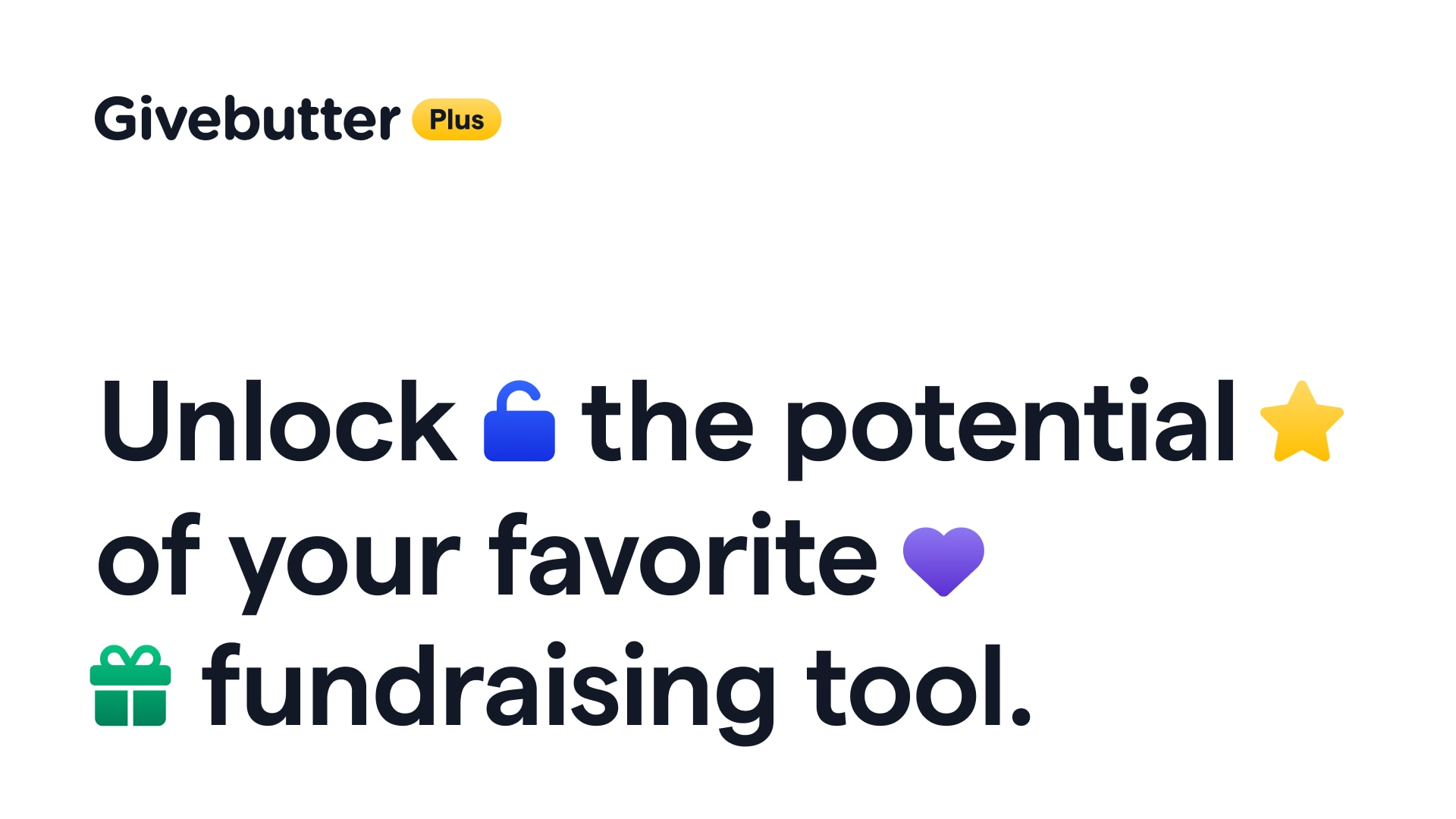
I provided direction and feedback to the brand designer to develop marketing assets with engaging yet consistent visuals. These designs would be used for our virtual launch event, social media ads, and within the Givebutter dashboard.
Facebook ad creative set
Selected slide deck designs from launch event
In-app graphic
The brand designer and I created a storyboard for our Givebutter Plus sizzle reel, which we handed off to our video specialist for animation. We worked with the marketing team and executive leadership to ensure we were telling a compelling story that spoke to our audience of nonprofits who wanted to increase and automate their fundraising.
Final promo video