brand exploration | web design

Page Builder Brand Refresh

The goal of this project was to modernized the visual brand of Page Builder, Shogun's user friendly drag-and-drop webpage building app for Shopify. As a Senior Marketing Designer, I led a visual refresh, including a collaborative workshop, visual exploration, and designing a landing page and ad creative.
process
process
process
process
process
process
process
process
process
process
process
process
process
process
process
process
process
process
process
process
process
process

Collaborative workshop

To kick off this project, I planned and facilitated a brainstorming workshop with people from the product design, content writing, product, and marketing design teams. The goal was to get a variety of perspectives on our current brand and how we can better represent the Page Builder product moving forward.

The consensus was that the current Page Builder brand showed that our product was easy to use and friendly, but the desired brand should also communicate sophistication and lightness/dreaminess. I consolidated the group's ideas into a list of attributes to describe the product and how we wanted to visually represent it. This served as the North Star for design throughout the project.

Existing Page Builder imagery

Miro board from brainstorming workshop

Attribute list from workshop

Discovery and exploration

Using the list of attributes, I put together a moodboard to explore a new visual style. This was also helpful in getting stakeholders on the same page before starting on the product shot designs.

Once the team was in agreement, I explored some new visual elements and how they might relate to the product UI. These included glass morphism, feathery gradients (sometimes with a gritty texture), and soft background imagery.

Moodboard

Visual exploration

deliverables
deliverables
deliverables
deliverables
deliverables
deliverables
deliverables
deliverables
deliverables
deliverables
deliverables
deliverables
deliverables
deliverables
deliverables
deliverables

Product shots

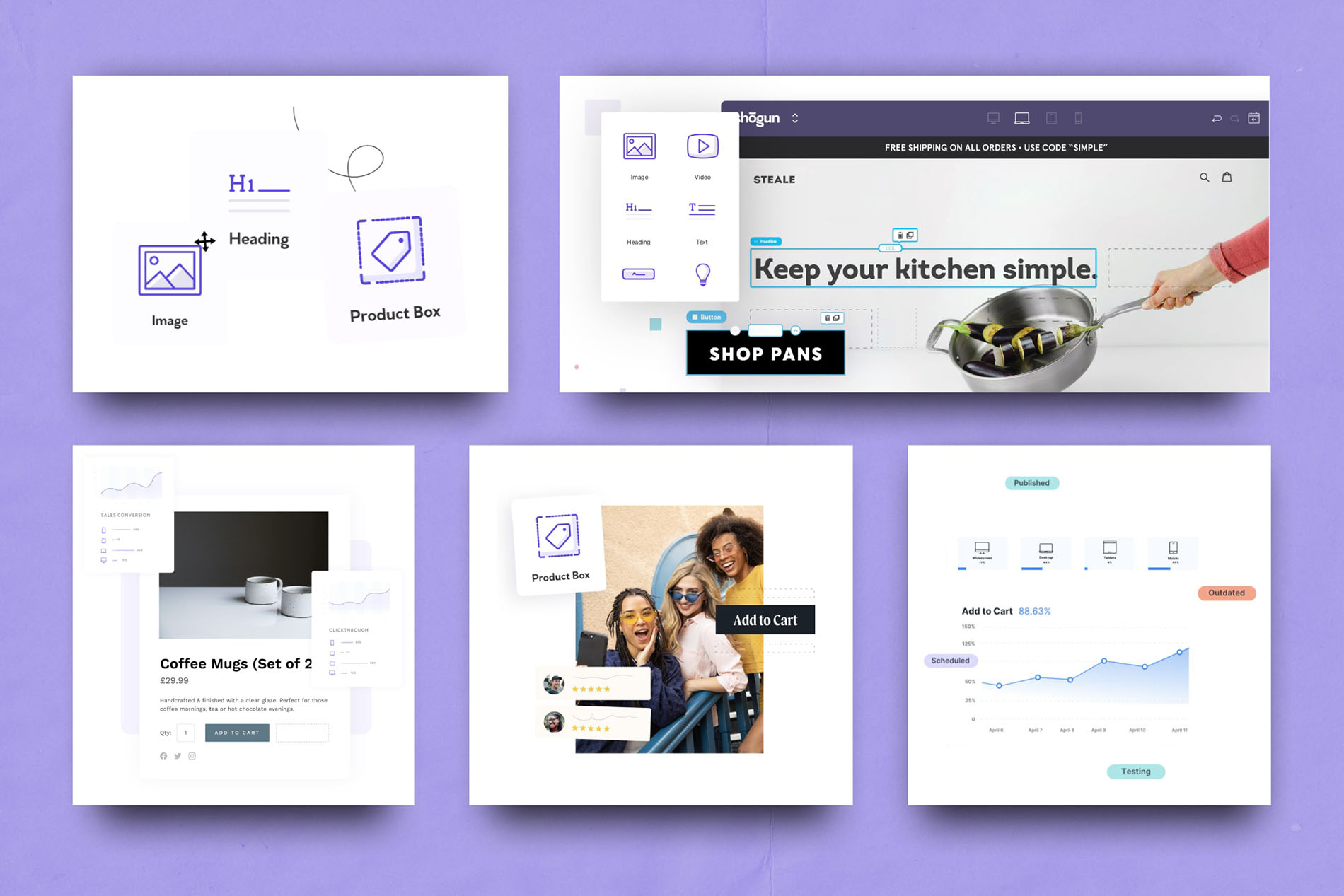
I created product shots for each of the main features and benefits outlined in the Page Builder product overview page. Each product shot is a combination of UI components from Page Builder, a fake store example (using a mini brand consisting of stock photography, type, and colors) and the new brand visual elements.

Analytics and drag and drop product shots

Performance product shot

Drag and drop product shot

Elements product shots

Landing page

I applied the refreshed visual language to a redesigned landing page that told a stronger visual story around Page Builder’s benefits. The structure emphasized problem/solution clarity, feature highlights, and social proof and case studies.

Social media campaign design

Using the new product shots, I created a series of ads in different sizes to drive more traffic to the newly refreshed landing page. The highest performing ads were those with human faces in the design, which is a finding I've applied to following projects.

Ad creative using various product shots

Ad creative at different aspect ratios

other projects
other projects
other projects
other projects
other projects
other projects
other projects
other projects
other projects
other projects
other projects
other projects
other projects
other projects