brand exploration | web design
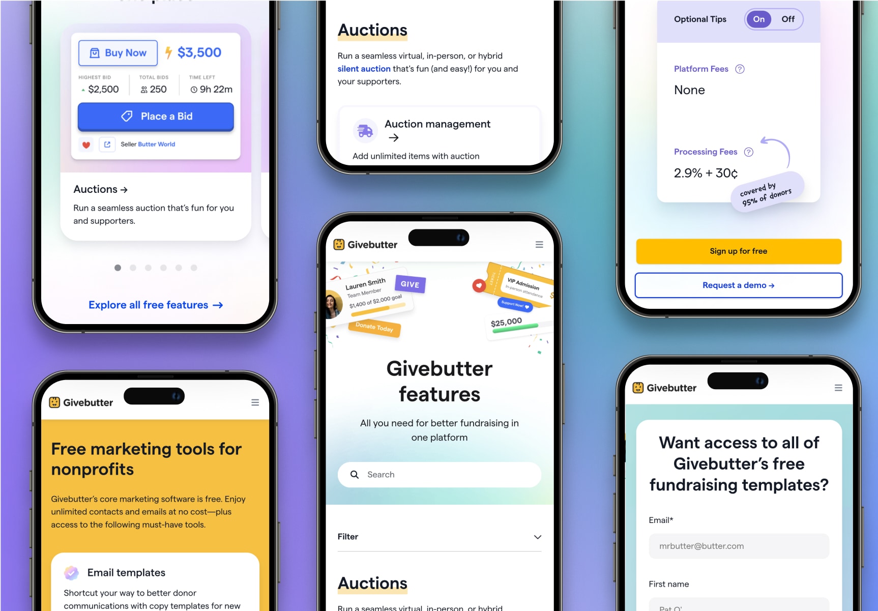
The goal of this project was to build a scalable, cohesive foundation for a fast-growing fundraising platform's website. As the sole web designer for Givebutter, I audited the existing site, created a component library, and implemented the new design system with our Webflow development agency, Finsweet.
Without a unified design system, Givebutter's website had many inconsistent styles and components across pages. I also observed an overuse of gradients resulting in low contrast visuals, inaccessible type and background color combinations, generic stock photography, and product shots without much personality. My goal with this new design system was to bring visual consistency, usability, and personality to every page.
Visuals from existing website
Givebutter has grown from an idea in a dorm room to a company that's powered over $5 billion in donations, and its website should reflect that. I modified the color palette so it could be used boldly with lots of contrast for accessibility, and I defined type styles with clear hierarchy. I also designed a component library including buttons, logos, and interactive elements like form fields and search bars to be used across the site.
Simplified brand styles
New Figma component library
I applied this system to key pages, including the homepage, pricing page, feature directory, freebies library, and core product pages. The new page designs are more cohesive, accessible, and efficient to create, and Givebutter's brand can shine through with bolder color usage and engaging product imagery.
Hero section of homepage
Feature directory before and after
Selected page sections
Icon design for navigation
Mobile designs